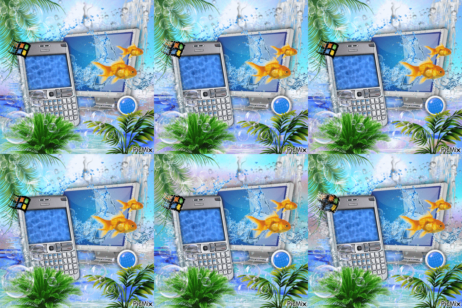
do you guys remember frutiger aero? that shiny, dreamy, futuristic look that was everywhere in the late 2000s? i was just a kid back then, but i still get hit with the biggest wave of nostalgia whenever i see those glossy buttons, bubbly itunes visuals, and windows aero’s transparent windows. it was like living in the future or at least what we thought the future would look like. frutiger aero was all about soft gradients, glassy reflections, and that weirdly satisfying "depth" in every ui element. it made even boring stuff like file explorers feel cool. for us 2000s kids, frutiger aero wasn’t just a design trend it was the vibe of our first digital memories. bring it back, please? lately, i’ve been seeing so much love for frutiger aero again. maybe it’s because we miss the optimism of the 2000s, or maybe we’re just tired of everything being so minimalist. either way, i’m here for the revival.

about me
i’m a guy from brazil who loves frutiger aero and anything that feels nostalgic and futuristic at the same time. i design websites for a living, make music, and spend most of my time creating things that look and sound cool.
